Can you guess how many websites and mobile applications a typical user interacts with daily? In America, each day we eat up an average of 6.5 hours of screen time accessing the internet across desktop and mobile devices. It's no wonder that the world of mobile app and web design and development has grown immensely over the last decade.
Did you know: In the final quarter of 2019, there were over 4.41 million iOS and Android apps available for download. To put it in perspective, 10 years ago there were only 51,000 available among both the Google Play and Apple App stores.
So what does it take to create an attractive, mobile app design or website design that delights and captivates users? You guessed it; an intuitive user experience and a seamless user interface design.
What is a Design System and Why is it Useful?
The design process can be messy and monotonous. To reduce the propensity for error and create scalability, designers build out a design system. Most practically defined as "a set of reasonable patterns and behaviors that define the product", a design system is a simple, yet seemingly revolutionary way to produce quality design work, efficiently. It is often described as the "single source of truth" for the entire team involved in a product's development.
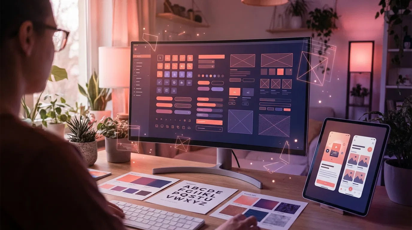
In designing any type of UI, a design team must set behaviors and implement the desired flow. By defining properties for the library of UI components including titles, texts, buttons, hover states, backgrounds, and images, etc, designers are creating a design system. By designing and then storing each state and behavior, when they need a button or image, they simply insert what they've already created and can be certain that it will match the other features of its type. Essentially, a design system allows a designer and his/her's entire team to "define and reuse."

A design system isn't a project. It's a product serving products. -- Nathan Curtis, EightShapes
What are the 5 Key Benefits of a Design System?
Structure, structure, structure Effectively utilizing a design system makes it easier for designers to reproduce their work. Building an attractive, useful, web or mobile design requires attention to detail and consistency. Users expect consistency (even if they don't voice it) and it's up to a designer to build out a system that eradicates discrepancies. Using and reusing a set of components means that as you build a new page or screen, you don't run the risk of introducing new errors.
Branding: A familiar pattern for the user Brand guidelines and design systems live in parallel to one another. A solid design system creates a framework for collaboration among the design, development, and digital marketing teams. It allows everyone to unite around one driving, consistent force. Perpetuating a consistent brand image is much easier with an established set of principles and guidelines for all teams to follow. Leveraging a design system helps strengthen brand identity, building from its foundation encourages every team member to reinforce the recognizable interface.
A few established examples of popular design systems come from top recognizable brands like Shopify, Airbnb, Google's Material Design, Atlassian, IBM, MailChimp, and of course, Apple and Microsoft. Check out this post for a set of the top 12 design system examples.
Reduces Overhead: Saves time and money Arguably the most prevalent benefit to building and leveraging a design system among your team and within the scope of your project is the reduction in overhead. Saving time means saving money and utilizing a design system speeds up the design process. If you've already built the library of UI components then implementing a new page/feature or modifying a current page, becomes a simple copy and paste process.
With a set of guidelines and rules to follow, when a manager reviews and provides feedback on the latest UI or interaction design, there will be fewer mistakes to scrutinize. Within a large team, among a big brand or when working with freelancers; the benefits of a design system, like a reduction in errors and the necessity to "double check" the details of a design, are exponential.
Clear communication with developers When designers are keeping their workspace "clean" using design tools like Sketch, or Zeplin (the preferred design tools of our team here at Singlemind) everything feeds together seamlessly. A "clean" design system accelerates delivery. The design tools will simply generate CSS and styles that the mobile and web development team can simply copy and paste into their code.
Implementing a design system not only reduces error and makes hand off easy but because the single source of truth is accompanied by a detailed "vocabulary" for the project, both design and development teams can essentially be "on the same page". Instead of referring to library components by their general appearance, "the orange arrow", designers can use their actual "title" as defined in the design system; leaving no room for accidental miscommunication.
Quality, quality, quality Did we mention that quality is a key benefit of leveraging a design system? When a user interacts with a mobile app or website's design and each and every element is consistent they automatically (though they may not understand why) perceive the design as higher quality.
When designers and developers rely on a design system, quality assurance (QA) specialists will too. Using the design system documentation to monitor any (rare) inconsistencies, a QA's job becomes simple.
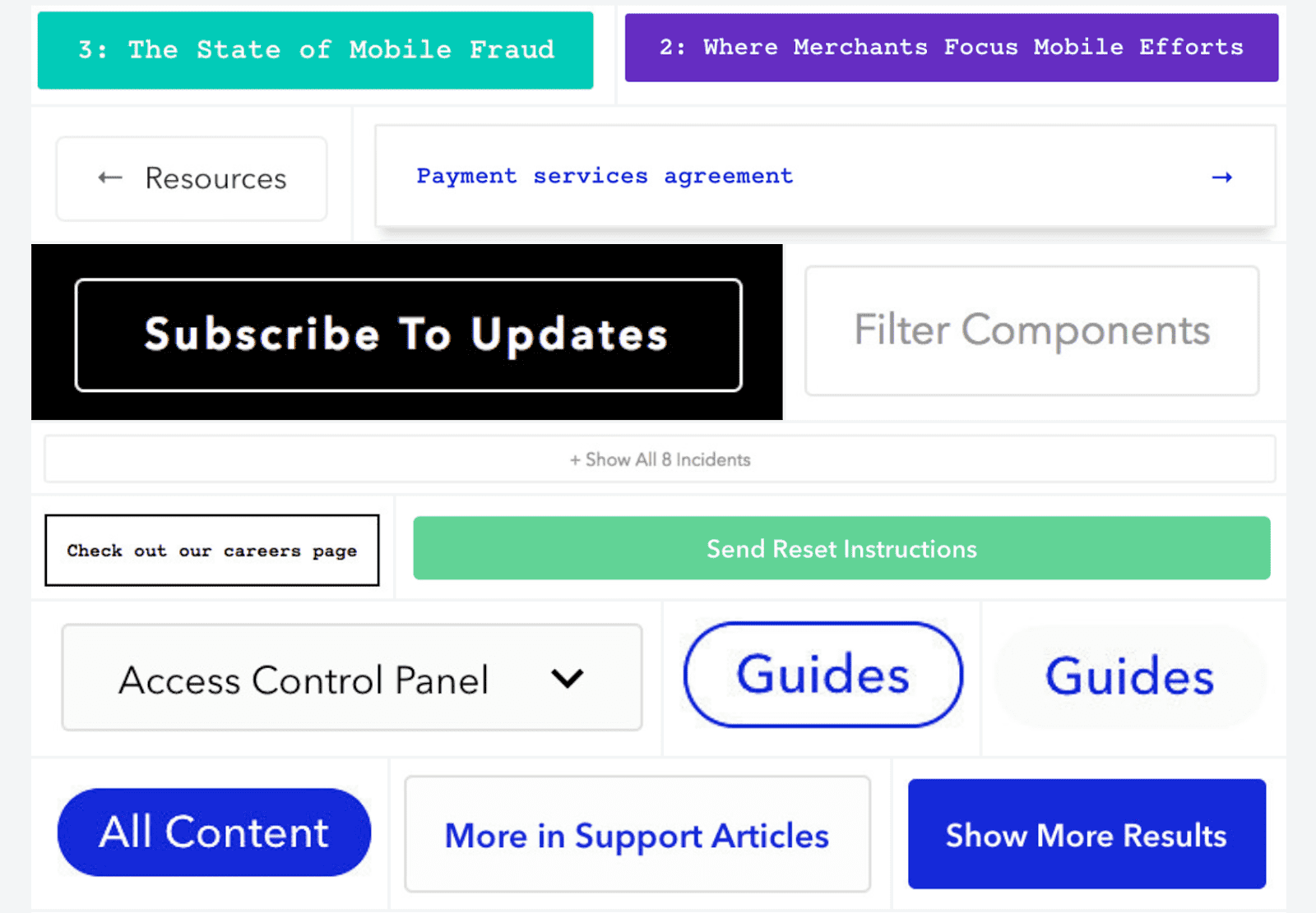
For example, check out this design audit from Braintree, they gathered a collection of their site's buttons and this (see the image below) was the distressing result. Where a user may not notice the disparities when viewing each button individually, after viewing them all in one place, the differences become quite visible and distracting. With a proper design system in place, the potential for this type of issue is eradicated from the onset of any design project.

Key Takeaways
Remember, a design system is a conduit for scale. Utilizing a design system builds structure and consistency into your design process. It elevates branding, reduces overhead, paves the way for clear communication between the design and development teams and ensures the shipment of quality design, in every respect.
Our UX Design team is proud to be honored by DesignRush as a Top Custom Website Design Company. We are excited to learn about your next project idea, contact us to get started.
Interested in UX Design? Keep reading!
3 Tips to Creating an Effective eCommerce Website Design


