What is Flat Design?
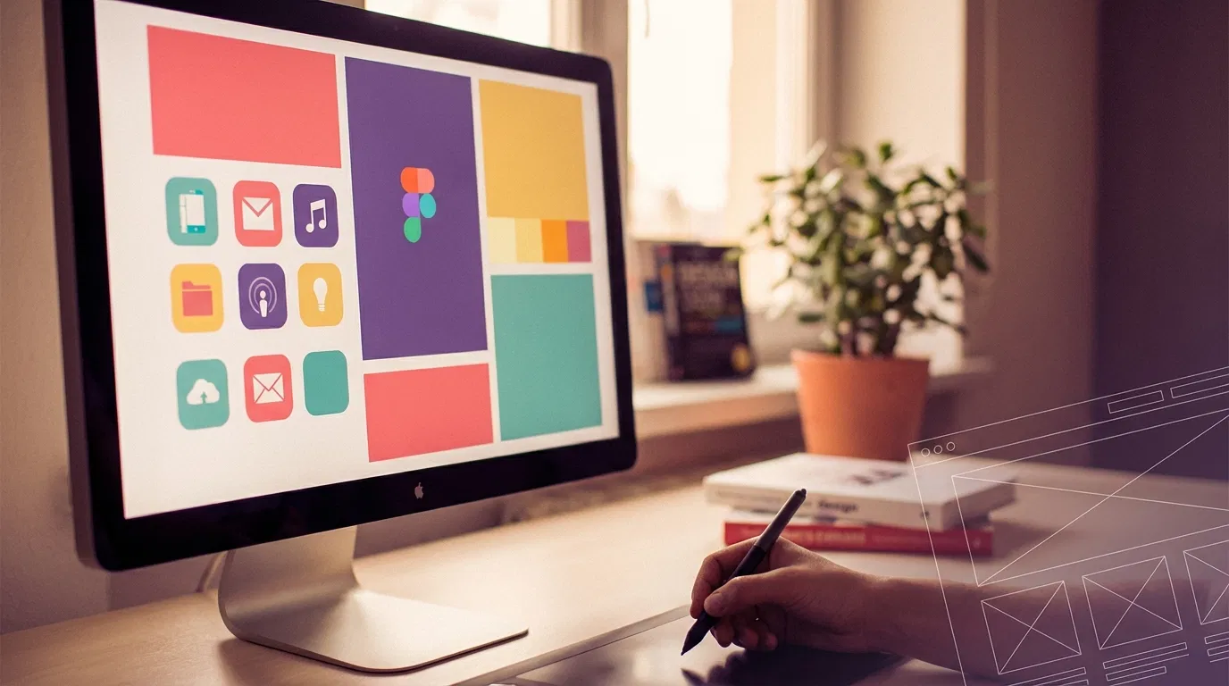
Flat design is a minimalist UI design approach that emphasizes usability. It features clean, open space, crisp edges, bright colors, and two-dimensional/flat illustrations. This design style removes any stylistic choices that give the illusion of three dimensions (such as drop shadows, gradients, textures, or other decorative elements) and focuses on a minimalist use of simple elements, typography, and flat colors.
Historical Context
While flat design seems like a recent trend, especially following Microsoft's Metro UI and Apple's iOS 7 redesign, its roots go back to earlier design movements:
- Swiss/International Style (1940s-50s): Emphasized cleanliness, readability, and objectivity with grid-based layouts, sans-serif typography, and bold, flat colors.
- Minimalism (1960s-70s): The artistic movement that championed the "less is more" philosophy, stripping away decorative elements to focus on the essential.
- Early Digital Interfaces (1980s-90s): Due to technical limitations, early computer interfaces were necessarily "flat" with limited colors and no complex visual effects.
Key Principles of Flat Design
- Minimalism: Removing unnecessary elements and focusing on simplicity.
- Typography: Strong emphasis on clear, readable typography, often using sans-serif fonts.
- Color: Vibrant, bold color palettes that create visual interest without dimensional effects.
- Simple Shapes: Use of basic geometric forms rather than complex, detailed illustrations.
- No Decorative Elements: Absence of drop shadows, gradients, textures, bevels, and other skeuomorphic details.
Flat Design vs. Skeuomorphism
Flat design emerged as a reaction against skeuomorphism, which dominated digital design in the early 2000s. Skeuomorphism uses real-world metaphors and textures to make digital interfaces resemble their physical counterparts (like a digital notepad that looks like a yellow legal pad with leather binding).
While skeuomorphism helped users transition to digital interfaces by providing familiar visual cues, it eventually became seen as cluttered and outdated. Flat design offered a cleaner alternative that embraced the digital medium rather than mimicking physical objects.
Benefits of Flat Design
- Improved Usability: Simpler interfaces can be easier to navigate and understand.
- Faster Loading Times: Without complex graphics, websites and apps load more quickly.
- Responsive Design Compatibility: Flat designs adapt more easily to different screen sizes.
- Clarity of Purpose: Without decorative distractions, users can focus on content and functionality.
- Forward-Looking: Embraces the digital medium rather than trying to mimic physical objects.
Criticisms and Challenges
- Usability Issues: Without shadows and depth cues, it can be harder for users to identify clickable elements.
- Homogeneity: Many flat designs look similar, potentially reducing brand distinctiveness.
- Trend Fatigue: As with any trend, overuse can lead to user boredom and designer frustration.
- Accessibility Concerns: Some flat designs use low contrast color schemes that can be difficult for visually impaired users.
Evolution: Flat Design 2.0
In response to these criticisms, "Flat Design 2.0" or "Semi-Flat Design" emerged, incorporating subtle shadows, highlights, and depth cues while maintaining the overall minimalist aesthetic. This evolution demonstrates how design trends rarely remain static but adapt to address practical concerns.
Recycled Trend or Innovation?
Is flat design truly innovative, or simply a recycling of earlier minimalist approaches? The answer lies somewhere in between:
- Recycled Elements: The core principles of simplicity, bold colors, and typography certainly draw from earlier design movements.
- Innovative Application: The application of these principles to digital interfaces, particularly responsive and mobile design, represents a meaningful innovation.
- Contextual Significance: Flat design's rejection of skeuomorphism marked an important maturation point in digital design, acknowledging that users no longer needed real-world metaphors to understand digital interfaces.
Conclusion
Flat design, like most design trends, represents both recycling and innovation. Its principles have historical precedents, but its widespread adoption in digital interfaces marked a significant shift in how we approach UI/UX design. Rather than viewing it as either entirely new or entirely derivative, we can appreciate flat design as part of the ongoing evolution of visual communication—responding to technological capabilities, user needs, and cultural contexts.
As with any design approach, the key is not blindly following trends but understanding the principles behind them and applying them thoughtfully to create interfaces that are both beautiful and functional for users.


